
The TabBar widget in Flutter is one of the most used widgets. It can be used to show various categories your app offers. After adding the default TabBar, sometimes you might need to change its colors such as background color, selected/unselected text color, indicator color, and the color of the splash and hover effect. So in this tutorial, we’ll see how to change tab bar color in Flutter.
Before we begin, you must add the TabBar to your page. The steps to add TabBar is mentioned here.
If you are a visual learner, you can quickly watch the steps here:
Here’s what we’ll cover:
- Steps to change tab bar background color in Flutter
- How to change tab bar text color (selected/unselected)
- Changing indicator color
- Change tab bar splash color
- How to change tab bar hover color
- Changing tab bar color globally (Bonus ⭐️)
Steps to change tab bar background color in Flutter
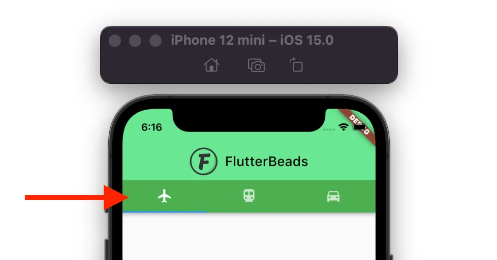
To change tab bar background color in Flutter, first, create a getter to return the TabBar widget and then wrap the TabBar widget inside the PreferredSize -> Material widget. Inside the Material add the color property and set the color of your choice.
Here are the instructions in detail:
- Create a getter that returns the actual TabBar.
- Wrap the
TabBarwidget inside thePreferredSize->Materialwidget. - Inside the
PreferredSize, set thepreferredSizeparameter to the_tabBar.preferredSize. - Inside the
Material, add thecolorparameter and set the color. - Run the App.
Code Example
TabBar get _tabBar => TabBar(
      tabs: [
        Tab(icon: Icon(Icons.flight)),
        Tab(icon: Icon(Icons.directions_transit)),
        Tab(icon: Icon(Icons.directions_car)),
      ],
    );
//-------
DefaultTabController(
  length: 3,
  child: Scaffold(
    appBar: AppBar(
      centerTitle: true,
      title: ...
      bottom: PreferredSize(
        preferredSize: _tabBar.preferredSize,
        child: Material(
          color: Colors.green, //<-- SEE HERE
          child: _tabBar,
        ),
      ),
      backgroundColor: const Color(0xff6ae792),
    ),
    body: TabBarView(
      children: [
        Icon(Icons.flight, size: 350),
        Icon(Icons.directions_transit, size: 350),
        Icon(Icons.directions_car, size: 350),
      ],
    ),
  ),
);Note: This solution also preserves the splash effect when you click on the Tab item.
Output
How to change tab bar text color (selected/unselected)
In tab bar, there are two states of the text. One is when tab is selected and another one is when the tab is unselected. To change the text color for selected state, inside the TabBar widget, add the labelColor property and set the color. To change the text color for the unselected state, add the unselectedLabelColor parameter and change it colors.
Code Example
const TabBar(
  labelColor: Colors.black, //<-- selected text color
  unselectedLabelColor: Colors.white, //<-- Unselected text color
  tabs: [
    Tab(text: 'Flight', icon: Icon(Icons.flight)),
    Tab(text: 'Train', icon: Icon(Icons.directions_transit)),
    Tab(text: 'Car', icon: Icon(Icons.directions_car)),
  ],
);
Output

Changing indicator color
Sometimes you may want to change the indicator color to match your deisng. To change the indicator color, locate the TabBar widget, add the indicatorColor property and set the color.
Code Example
const TabBar(
  indicatorColor: Colors.black, //<-- SEE HERE
  tabs: [
    Tab(text: 'Flight', icon: Icon(Icons.flight)),
    Tab(text: 'Train', icon: Icon(Icons.directions_transit)),
    Tab(text: 'Car', icon: Icon(Icons.directions_car)),
  ],
)
Output

Change tab bar splash color
Splash color is the color that appears when your press and hold on the widget. To change the tab bar splash color, first change the tab bar color as per the instructions here and then wrap the tab bar widget inside the Theme widget. Now add the data property and change the splash color using the ThemeData().copyWith() method.
Code Example
TabBar get _tabBar => TabBar(
      tabs: [
        Tab(icon: Icon(Icons.flight)),
        Tab(icon: Icon(Icons.directions_transit)),
        Tab(icon: Icon(Icons.directions_car)),
      ],
    );
//-------
DefaultTabController(
  length: 3,
  child: Scaffold(
    appBar: AppBar(
      centerTitle: true,
      title: ...
      bottom: PreferredSize(
        preferredSize: _tabBar.preferredSize,
        child: Material(
          color: Colors.green,
          child: Theme( //<-- SEE HERE
              data: ThemeData().copyWith(splashColor: Colors.redAccent),
              child: _tabBar),
        ),
      ),
      backgroundColor: const Color(0xff6ae792),
    ),
    body: TabBarView(
      children: [
        Icon(Icons.flight, size: 350),
        Icon(Icons.directions_transit, size: 350),
        Icon(Icons.directions_car, size: 350),
      ],
    ),
  ),
);
Output

How to change tab bar hover color
Hover color is the color that appears when the mouse point hovers over the widget. This color is not visible on mobile devices. To change the tab bar hover color, inside the TabBar widget, add the overlayColor property and assign the color based on state such as on press, on hover and on focued.
Here’s how you do it:
- Add the
TabBarwidget. - Add the
overlayColorparameter (inside TabBar) and assign theMaterialStateProperty.resolveWith(). - Check whether the
stateishovered, if yes retrun the color of your choice.
Code Example
TabBar(
  overlayColor: MaterialStateProperty.resolveWith<Color?>(
    (Set<MaterialState> states) {
      if (states.contains(MaterialState.hovered))
        return Colors.amberAccent; //<-- SEE HERE
      return null;
    },
  ),
  tabs: [
    Tab(icon: Icon(Icons.flight)),
    Tab(icon: Icon(Icons.directions_transit)),
    Tab(icon: Icon(Icons.directions_car)),
  ],
)
Output

Changing tab bar color globally
In the previous section, we saw how to change the tab bar color at the page level. but sometimes you might be looking to have a common style across all the pages of your app. In that case, you might want to change the tab bar color at the app level.
Here’s how you do it:
Step 1: Locate the MaterialApp widget.
Step 2: Inside the MaterialApp, add the theme parameter with ThemeData class assigned.
Step 3: Inside the ThemeData add the tabBarTheme parameter and then assign the TabBarTheme.
Step 4: Inside the TabBarTheme add the paramters such as labelColor, overlayColor, unselectedLabelColor.
Step 5: Inside the these paramter set the color of your choice.
Code Example
MaterialApp(
  title: 'Flutter Demo',
  theme: ThemeData(
    primarySwatch: Colors.blue,
    tabBarTheme: TabBarTheme(labelColor: Colors.black), //<-- SEE HERE
  ),
  home: ChangeTabBarColorDemo(),
);
Conclusion
In this tutorial, we learned how to change tab bar color in Flutter with practical examples, we first saw how to change the color for the background, text color, indicator color and later explored how to change the hover color and splash cover. We also went through the code to change the color at the app level.
Would you like to check other interesting Flutter tutorials?