
The AppBar widget is essential for any mobile app. It is used to show important information such as the page title, tabs, images, and actions that can be taken on the page.
For example, the AppBar might show a full profile picture when the user scrolls up and slowly transition to show only the user name when the user scrolls down. This effect is called a floating app bar. In Flutter this can be achieved using the widget called SliverAppBar.
In this tutorial, we’ll show you how to implement the SliverAppBar widget in a Flutter app by walking through some practical examples.
Here’s what we’ll cover:
- What is SliverAppBar?
- Customizing the floating behavior
- Adding AppBar inside SliverAppBar
- Adding TabBar with SliverAppBar
- Listening to SliverAppBar’s status (expanded/collapsed)
What is SliverAppBar?
In Flutter, SliverAppBar is a successor to the AppBar widget, which allows you to create the floating app bar effect. The SliverAppBar expands the AppBar when the screen is scrolled up and collapsed on scroll down.
You can also completely remove or hide the AppBar when the user is scrolling down a long list. SliverAppBar has got a lot of customization options so you can tailor it to your needs.
If you’re a visual learner, check out this quick video tutorial:
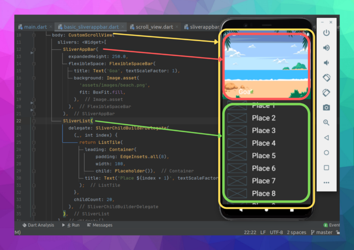
Here is the minimal code to get SliverAppBar up and running:
return Scaffold(
  //1
  body: CustomScrollView(
    slivers: <Widget>[
      //2
      SliverAppBar(
        expandedHeight: 250.0,
        flexibleSpace: FlexibleSpaceBar(
          title: Text('Goa', textScaleFactor: 1),
          background: Image.asset(
            'assets/images/beach.png',
            fit: BoxFit.fill,
          ),
        ),
      ),
      //3
      SliverList(
        delegate: SliverChildBuilderDelegate(
          (_, int index) {
            return ListTile(
              leading: Container(
                  padding: EdgeInsets.all(8),
                  width: 100,
                  child: Placeholder()),
              title: Text('Place ${index + 1}', textScaleFactor: 2),
            );
          },
          childCount: 20,
        ),
      ),
    ],
  ),
);
To add CustomScrollView, place CustomScrollView in the body section of the Scaffold widget. This is used to synchronize the scroll position of the AppBar and the list.
There are several widgets that can be added to CustomScrollView, and SliverAppBar is one of them.
SliverAppBar provides all the features of the normal AppBar widget with the addition of animating it. flexibleSpace is used to show any widget when the AppBar is expanded. expandedHeight is used to set the height of FlexibleSpaceBar the widget.
SliverList shows the list of items. We can’t use the normal ListView class because CustomScrollView accepts the widget of type sliver.
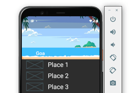
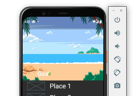
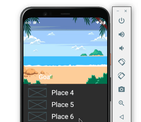
Here is the output:

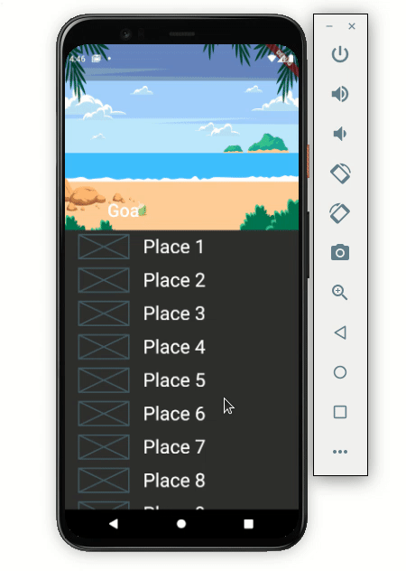
Here’s how the code translates into the design:
Customizing the floating behavior
The default behavior will hide the SliverAppBar when scrolling down and expand when the first item in the list is reached upon scrolling up. However, SliverAppBar has options to customize this behavior.
SliverAppBar has three important properties known as pinned, snap and floating. Setting the combination of these three parameters allows the SliverAppBar to work as you need it to.
Let’s demonstrate how these properties work by looking at a practical example.
pinned: true,snap: false,floating: false:
Setting only a pinned value to true sticks the SliverAppBar at the top when scrolling down. SliverAppBar expands only when the first item in the list is reached when scrolling up.

pinned: true,snap: true,floating: true:
When all the parameters are set to true, SliverAppBar sticks at the top on scrolling down and expands fully on scrolling up a bit, even though the first item in the list is not reached.

pinned: true,snap: false,floating: true:
When only the snap value is set to false, the SliverAppBar stays on top while scrolling down. The background image starts expanding as we scroll up and stops with our scroll.

pinned: false,snap: false,floating: true:
Setting only the floating value to true hides the SliverAppBar on scrolling down and starts showing the background image as we scroll in an upward direction.


pinned: false,snap: true,floating: true:
If you want to keep SliverAppBar hidden when scrolling down and show to the full background image when scrolling up a bit, even when the first item in the list is not shown. you can set only the snap and floating to true.


Adding AppBar inside SliverAppBar
It’s important to note that SliverAppBar is not a complete replacement for the normal AppBar. The beauty of writing apps in Flutter is that you can mix and match widgets to create something new.
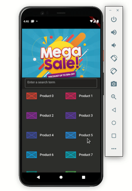
For example, you may run into a situation where you need to show an AppBar containing a search box inside the SliverAppBar.
Let’s look at an example. Below is an e-commerce app where the banner image is hidden when scrolling down and the search box remains stuck at the top.

Here’s how to do that:
Scaffold(
  body: CustomScrollView(
    slivers: <Widget>[
      SliverAppBar(
        ...
        bottom: AppBar(
          title: Container(
            height: 45,
            child: TextField(
              decoration: InputDecoration(
                  border: OutlineInputBorder(),
                  hintText: 'Enter a search term'),
            ),
          ),
        ),
      ),
      SliverGrid(
        gridDelegate: SliverGridDelegateWithFixedCrossAxisCount(
          crossAxisCount: 2,
          childAspectRatio: 2,
        ),
        delegate: SliverChildBuilderDelegate(
          (BuildContext context, int index) {
            return ItemTile(index);
          },
        ),
      ),
    ],
  ),
)
Let’s break down the code. First, just write a normal AppBar in the bottom property of the SliverAppBar. The AppBar will contain the TextField widget as an input box for searching the items.
The list of items is shown in the SliverGrid. As we have used CutomScrollView, we can’t use the normal GridView here.
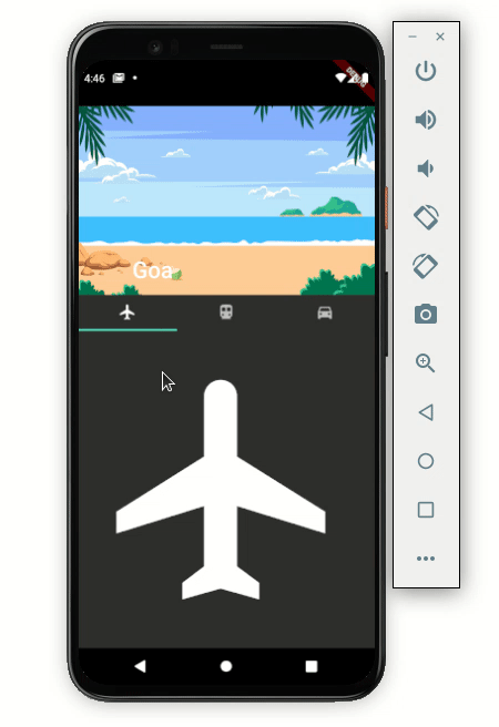
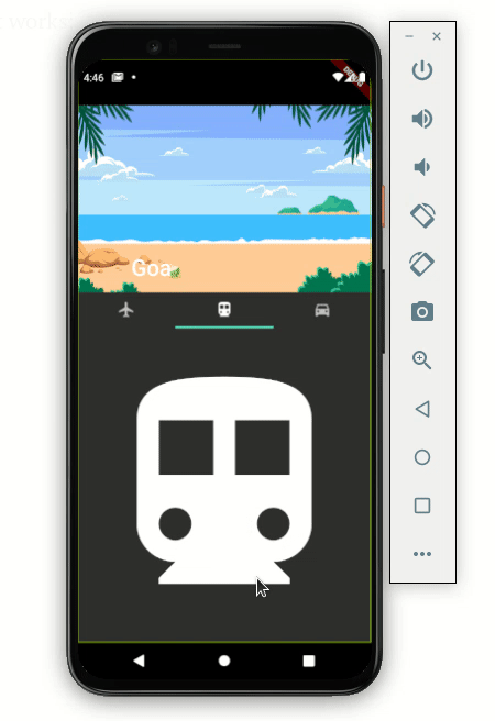
Adding TabBar with SliverAppBar
The TabBar widget is used to show different categories of content or features available to users. In some cases, you may want to show the TabBar with SliverAppBar.
Let’s walk through how to add the TabBar and make it behave like in the following example:

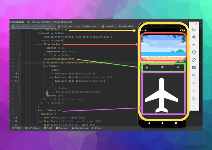
Scaffold(
  body: DefaultTabController(
    length: 3,
    child: NestedScrollView(
      headerSliverBuilder:
          (BuildContext context, bool innerBoxIsScrolled) {
        return <Widget>[
          SliverAppBar(
            pinned: false,
            expandedHeight: 250.0,
            flexibleSpace: FlexibleSpaceBar(
              title: Text('Goa', textScaleFactor: 1),
              background: Image.asset(
                'assets/images/beach.png',
                fit: BoxFit.fill,
              ),
              stretchModes: [StretchMode.zoomBackground],
            ),
            //collapsedHeight: 100,
          ),
          SliverPersistentHeader(
            delegate: MySliverPersistentHeaderDelegate(
              TabBar(
                tabs: [
                  Tab(icon: Icon(Icons.flight)),
                  Tab(icon: Icon(Icons.directions_transit)),
                  Tab(icon: Icon(Icons.directions_car)),
                ],
              ),
            ),
            pinned: false,
          ),
        ];
      },
      body: TabBarView(
        children: [
          Icon(Icons.flight, size: 350),
          Icon(Icons.directions_transit, size: 350),
          Icon(Icons.directions_car, size: 350),
        ],
      ),
    ),
  ),
)
The NestedScrollView widget is used to return the header as a combination of the SliverAppBar and SliverPersistentHeader widgets. SliverAppBar internally uses SliverPersistentHeader for the shrinking and growing effect. You can use this widget to show the tabs below the SliverAppBar.
TabBarView is given in the body parameter of the NestedScrollView widget.
Here’s how the above code translates into the design:

Pinning the TabBar
If you look carefully, the TabBar is hidden when scrolling down. To improve the user experience, you should always keep the TabBar visible on top when scrolling down.
Setting the pinned value to true in SliverPersistentHeader will solve this problem.
SliverPersistentHeader(
  delegate: MySliverPersistentHeaderDelegate(
    TabBar(
      tabs: [
        ...
      ],
    ),
  ),
  pinned: true,
)
Here’s how it works:

Listening to SliverAppBar’s status (expanded or collapsed)
If want to listen to the SliverAppBar’s status to determine whether it’s expanded or collapsed, you can use the returned value to change the SliverAppBar settings. For example, you might change the text color of the title when it is expanded.
late ScrollController _scrollController;
//----------
@override
void initState() {
  // TODO: implement initState
  super.initState();
  _scrollController = ScrollController()
    ..addListener(() {
      setState(() {
        _textColor = _isSliverAppBarExpanded ? Colors.white : Colors.blue;
      });
    });
}
//----------
bool get _isSliverAppBarExpanded {
  return _scrollController.hasClients &&
      _scrollController.offset > (200 - kToolbarHeight);
}
//----------
Scaffold(
  body: CustomScrollView(
    controller: _scrollController,
    slivers: ...,
  ),
);- ScrollController is created and assigned to CustomScrollView
- The listener is added to ScrollController to calculate whether SliverAppBar is expanded or not
- The returned value from the listener is used to set the text color for the title
Here’s is the output that changes the color of the title “Goa” when SliverAppBar is expanded:

Conclusion
If you’ve made it this far, you should have all the requisite knowledge to add the SliverAppBar in your Flutter app.
The full code used for this example is available on GitHub.
Would you like to check other interesting Flutter tutorials?
