Flutter allows you to mix and match various widgets to create a fully customizable UI. Sometimes you may need to add a button that has an icon in the center. You might have already tried the IconButton. But then you need the circle around the Icon button. So in this tutorial, we’ll see the top 2 ways to create a circle icon button in Flutter.
Here’s how it looks:
Here’s what we’ll cover:
Need of Circle Icon Button
Buttons allow users to perform any action when tapped. Typically buttons are available in a rounded rectangular shape. But sometimes because of space constraints, you may need to replace the button text with an icon and its shape to a circle. and hence you may need to create a fully circular icon button.
Ways to Create Circle Icon Button in Flutter
There are many ways to create a circle icon Button in Flutter, but in this tutorial, we’ll cover only the following top 2 approaches:
- Using the FloatingActionButton
- Using the ElevatedButton
1. Using the FloatingActionButton (Recommended)
The FloatingActionButton is a dedicated widget to create the circular icon button.
Creating Basic Button
Steps to create a basic circle icon button using FloatingActionButton:
Step 1: Add the FloatingActionButton to your page.
Step 2: Inside FloatingActionButton, Add the child parameter and then add the actual icon inside.
Code Example:
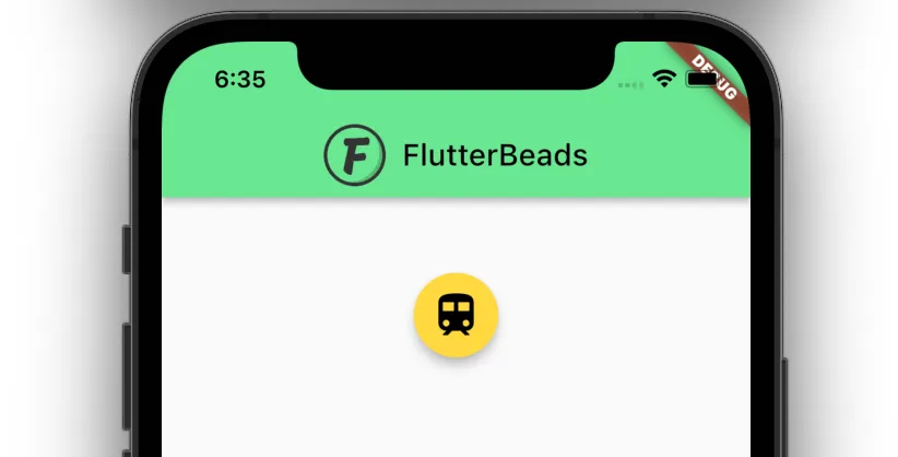
FloatingActionButton(
  backgroundColor: Colors.amberAccent,
  onPressed: () {},
  child: Icon(
    Icons.train,
    size: 35,
    color: Colors.black,
  ),
),
Output:
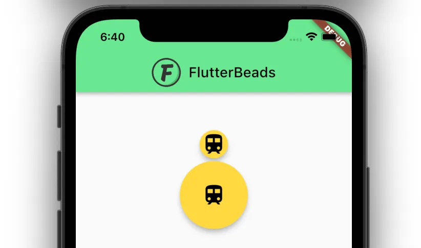
Changing Button Size
You may want to change the default size of the FloatingActionButon to small or bigger.
To change the button size, simply replace the FloatingActionButton widget with the named constructor. i.e. FloatingActionButton.small() or FloatingActionButton.large()
Code Example:
FloatingActionButton.small( //<-- SEE HERE
  backgroundColor: Colors.amberAccent,
  onPressed: () {},
  child: Icon(
    Icons.train,
    size: 35,
    color: Colors.black,
  ),
),
FloatingActionButton.large( //<-- SEE HERE
  backgroundColor: Colors.amberAccent,
  onPressed: () {},
  child: Icon(
    Icons.train,
    size: 35,
    color: Colors.black,
  ),
),
Output:
Custom Size
Sometimes you may want to have a custom size button rather than going with the predefined-sized button.
To create a circle button with custom size:
Step 1: Add the SizedBox widget to your page and give fixed height, width.
Step 2: Inside the SizedBox, add the FittedBox widget.
Step 3: Inside the FittedBox widget, add the FloatingActionButton as you would normally do.
Code Example:
SizedBox( //<-- SEE HERE
  width: 150,
  height: 150,
  child: FittedBox( //<-- SEE HERE
    child: FloatingActionButton( //<-- SEE HERE
      backgroundColor: Colors.amberAccent,
      onPressed: () {},
      child: Icon(
        Icons.train,
        size: 35,
        color: Colors.black,
      ),
    ),
  ),
),
Output:
2. Using the ElevatedButton
If at all the FloatingActionButton is unable to fulfill your requirement, you can use the ElevatedButton.
Creating Basic Button
Steps to create a basic circle icon button using ElevatedButton:
Step 1: Add the ElevatedButton to your page.
Step 2: Inside ElevatedButton, Add the child parameter and then add the actual icon inside.
Step 3: Inside ElevatedButton, Add the style parameter and then add the ElevatedButton.styleFrom.
Step 4: Inside the ElevatedButton.styleFrom add the shape parameter and assign the CircleBorder class.
Code Example:
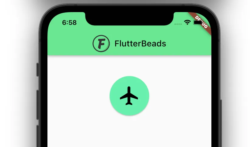
ElevatedButton(
  onPressed: () {},
  child: Icon( //<-- SEE HERE
    Icons.train,
    color: Colors.black,
    size: 54,
  ),
  style: ElevatedButton.styleFrom(
    shape: CircleBorder(), //<-- SEE HERE
    padding: EdgeInsets.all(20),
  ),
),
Output:
Conclusion
In this tutorial, we learned how to create the circle icon button in Flutter. We saw that we can create the circle icon button using FloatingActionButton as well as the ElevatedButton. We also explored that using FloatingActionButton we can customize the size of the circle button.
Would you like to check other interesting Flutter tutorials?
