
The Card widget in Flutter is one of the most used widgets. It is used to display the related information together. For example, showing product details card in a list. But after adding the default Card, sometimes you might need to customize the border of the Card. So in this tutorial, we will see how to add and customize the Card border in Flutter.
Here are different versions of the card border:

Here’s what we’ll cover:
- How to add border to a card in Flutter
- How to add border radius / rounded border to the card
- Add or Change card border color
- Remove card border (No border)
- Showing card border on only one side (bottom or left)
- Specifying card border shape
- Changing shadow color of card border
- Changing card border thickness
- Customize card border globally (Bonus ⭐️)
How to add border to a card in Flutter
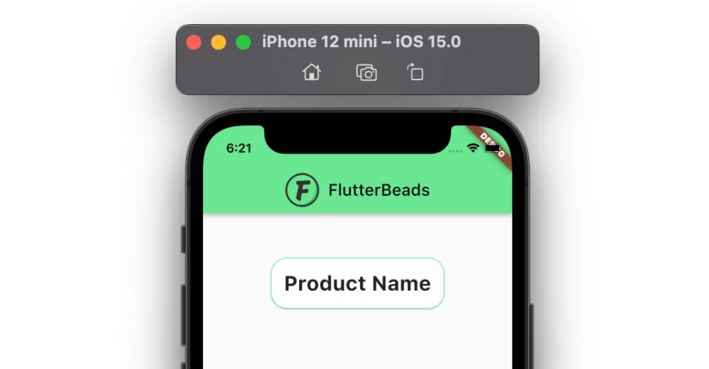
To add border to card in Flutter, Inside the Card, you can specify the shape property and then use the RoundedRectangleBorder, BeveledRectangleBorder, or StadiumBorder widgets. Using any of these widgets you can add BorderSide widget with color and width parameters to create the border around the card.
Here are step by step instructions the to add border to card in Flutter:
- Locate the file where you have placed the
cardwidget. - Inside the
Cardwidget, add theshapeproperty and assign theRoundedRectangleBorderwidget. - Inside the
RoundedRectangleBorder, add thesideproperty and assign theBorderSidewidget. - Inside the
BorderSide, add thecolorproperty to specify the color.
Code Example
Card(
  shape: RoundedRectangleBorder( //<-- SEE HERE
    side: BorderSide(
      color: Colors.greenAccent,
    ),
  ),
  child: Container(
    padding: EdgeInsets.all(16),
    child: Text(
      'Product Name',
      style: TextStyle(fontSize: 25, fontWeight: FontWeight.bold),
    ),
  ),
)
Output

How to add border radius / rounded border to the card
To add border radius or create a rounded border around the card you can add the shape property and then assign the RoundedRectangleBorder widget. Using RoundedRectangleBorder widget you can specify the borderRadius property and create the rounded border using the BorderRadius.circular(20.0). Feel free to customized this value :)
Code Example
Card(
  shape: RoundedRectangleBorder(
    side: BorderSide(
      color: Colors.greenAccent,
    ),
    borderRadius: BorderRadius.circular(20.0), //<-- SEE HERE
  ),
  child: Container(
    padding: EdgeInsets.all(16),
    child: Text(
      'Product Name',
      style: TextStyle(fontSize: 25, fontWeight: FontWeight.bold),
    ),
  ),
)
Output
Add or Change card border color
To add or change the card border color, first, find the Card widget for which you would like to change the border color. Inside the Card widget, add the BorderSide widget and then add or change the color parameter to the color of your choice.
Code Example
Card(
  shape: RoundedRectangleBorder(
    side: BorderSide(
      color: Colors.deepPurpleAccent, //<-- SEE HERE
    ),
    borderRadius: BorderRadius.circular(20.0),
  ),
  child: Container(
    padding: EdgeInsets.all(16),
    child: Text(
      'Product Name',
      style: TextStyle(fontSize: 25, fontWeight: FontWeight.bold),
    ),
  ),
)
Output

Remove card border (No border)
You can remove the card border or completely have no border around the card by setting the elevation property to 0.
Code Example
Card(
  elevation: 0, //<-- SEE HERE
  child: Container(
    padding: EdgeInsets.all(16),
    child: Text(
      'Product Name',
      style: TextStyle(fontSize: 25, fontWeight: FontWeight.bold),
    ),
  ),
),
Output

Showing card border on only one side (bottom or left)
Sometimes you might need to create a card that has only one border around it. Which can be either on the left/right or at the bottom. To show the card border only on either bottom or left side, you can use the Container widget and add border only on one side by following the instructions here.
Code Example
Card(
  child: ClipPath(
    child: Container(
      padding: EdgeInsets.all(16),
      decoration: BoxDecoration(
        border: Border(
          left: BorderSide(color: Colors.greenAccent, width: 5),
        ),
      ),
      child: Text(
        'Product Name',
        style: TextStyle(fontSize: 25, fontWeight: FontWeight.bold),
      ),
    ),
    clipper: ShapeBorderClipper(
        shape: RoundedRectangleBorder(
            borderRadius: BorderRadius.circular(3))),
  ),
)
Output

Note: If you notice, you could see the rounded corner around the card. That is created using the ClipPath widget. It simply clips whatever is inside of it as per the specified path.
If you are a visual learner, you can learn about the ClipPath in the video below:
Specifying card border shape
You can define the card border shape by using three widgets. 1. RoundedRectangleBorder 2. BeveledRectangleBorder 3. StadiumBorder. Each of these widgets creates different types of borders around the card.
Code Example
Card(
  shape: RoundedRectangleBorder( //<-- 1. SEE HERE
    side: BorderSide(
      color: Colors.greenAccent,
      width: 3,
    ),
    borderRadius: BorderRadius.circular(20.0),
  ),
  child: Container(
    padding: EdgeInsets.all(16),
    child: Text(
      'Product Name',
      style: TextStyle(fontSize: 25, fontWeight: FontWeight.bold),
    ),
  ),
),
Card(
  shape: BeveledRectangleBorder( //<-- 2. SEE HERE
    side: BorderSide(
      color: Colors.greenAccent,
      width: 3,
    ),
    borderRadius: BorderRadius.circular(20.0),
  ),
  child: Container(
    padding: EdgeInsets.all(16),
    child: Text(
      'Product Name',
      style: TextStyle(fontSize: 25, fontWeight: FontWeight.bold),
    ),
  ),
),
Card(
  shape: StadiumBorder( //<-- 3. SEE HERE
    side: BorderSide(
      color: Colors.greenAccent,
      width: 2.0,
    ),
  ),
  child: Container(
    padding: EdgeInsets.all(16),
    child: Text(
      'Product Name',
      style: TextStyle(fontSize: 25, fontWeight: FontWeight.bold),
    ),
  ),
),
Output

Changing shadow color of card border
You can change the shadow color of the card border by wrapping the card widget inside the Container widget. Inside the container widget, you can create a shadow by using the BoxShadow widget.
Code Example
Container(
  child: new Card(
    child: Container(
      padding: EdgeInsets.all(16),
      child: Text(
        'Product Name',
        style: TextStyle(fontSize: 25, fontWeight: FontWeight.bold),
      ),
    ),
  ),
  decoration: new BoxDecoration(
    boxShadow: [
      BoxShadow( //<-- SEE HERE
        color: Colors.greenAccent,
        blurRadius: 10.0,
      ),
    ],
  ),
)
Output

Changing card border thickness
To change the card border thickness, you can specify the shape property and then use any of the RoundedRectangleBorder, BeveledRectangleBorder, or StadiumBorder widgets. Using any of these widgets you can add BorderSide widget with width property to change the card border thickness.
Code Example
Card(
  shape: RoundedRectangleBorder(
    side: BorderSide(
      color: Colors.greenAccent,
      width: 5, //<-- SEE HERE
    ),
    borderRadius: BorderRadius.circular(20.0),
  ),
  child: Container(
    padding: EdgeInsets.all(16),
    child: Text(
      'Product Name',
      style: TextStyle(fontSize: 25, fontWeight: FontWeight.bold),
    ),
  ),
)
Output

Customize card border globally(Bonus ⭐️)
In the previous section, we saw how to customize the card border at the page level. but sometimes you might be looking to have a common style across all the pages of your app. In that case, you might want to customize the card border color at the app level.
You can change the card border color globally by defining the cardTheme and then adding the CardTheme widget. Inside the CardTheme widget, you can specify which type of border you want to change. for example, RoundedRectangleBorder, BeveledRectangleBorder, StadiumBorder and then add the side and borderRadius property to add the border.
Here’s how you do it:
- Locate the
MaterialAppwidget. - Inside the MaterialApp, add the
themeparameter withThemeDataclass assigned. - Inside the
ThemeDataadd thecardThemeparameter and then assign theCardTheme. - Inside the
CardThemeadd theshapeparameter and then assign theRoundedRectangleBorder. - Inside the
RoundedRectangleBorderadd thesideparameter and then assign theBorderSidewithcolorandwidthof your choice.
Code Example
MaterialApp(
  title: 'Flutter Demo',
  theme: ThemeData(
    primarySwatch: Colors.blue,
    cardTheme: CardTheme( //<-- SEE HERE
        shape: RoundedRectangleBorder(
      side: BorderSide(
        color: Colors.greenAccent,
        width: 5,
      ),
      borderRadius: BorderRadius.circular(20.0),
    ),
   ),
  ),
  home: CardBorderDemo(),
);
Conclusion
In this tutorial, we learned how to customize card border in Flutter with practical examples, we first saw how to add a border, add border-radius, change the border color, remove the border color, and later explored how to add a border to only one side (bottom or left )of the card, change border shape, shadow color and thickness. We also went through the code to customize the card border at the app level.
Would you like to check other interesting Flutter tutorials?
