
The ListTile widget in Flutter is one of the most used widgets. It is used to display some information about the item. It is mostly used inside the ListView. But after adding the default ListTile, sometimes you might need to add or customize the border of the ListTile. So in this tutorial, we will see how to add and customize the ListTile border in Flutter.
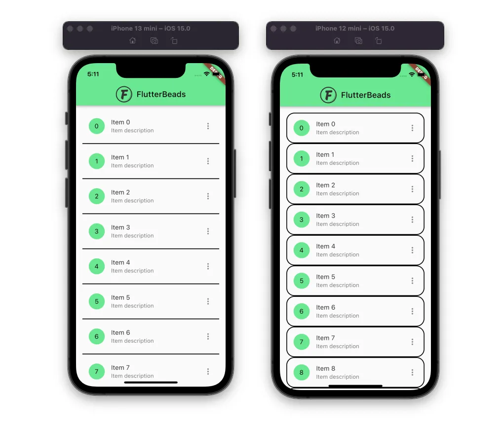
Here are different versions of the ListTile border:
Here’s what we’ll cover:
- How to add border to ListTile in Flutter
- How to add ListTile border radius or rounded border
- Changing ListTile border color
- Adding ListTile bottom or top border
- ListTile shape border
- Adding divider between ListTiles (Best approach ⭐️)
Before we proceed further, here’s the official video on how to use the ListTile widget:
How to add border to ListTile in Flutter
You can add border to ListTile in Flutter by adding a shape to it. While providing the shape parameter, you can add various shapes such as RoundedRectangleBorder, StadiumBorder, and BeveledRectangleBorder.
To add border to ListTile in Flutter:
- Locate the file where you have placed the
ListTilewidget. - Add the
shapeparameter and assign eitherRoundedRectangleBorder,StadiumBorder,orBeveledRectangleBorder. - For example, if you have added
RoundedRectangleBorder,then, Inside theRoundedRectangleBorderwidget, add thesideproperty and assign theBorderSide(width: 2)widget. - Also, add the
borderRadiusproperty and assign theBorderRadius.circular(20).
Code Example
final List<String> items = List<String>.generate(10, (i) => '$i');
ListTile(
  shape: RoundedRectangleBorder( //<-- SEE HERE
    side: BorderSide(width: 2),
    borderRadius: BorderRadius.circular(20),
  ),
  leading: CircleAvatar(
    backgroundColor: const Color(0xff6ae792),
    child: Text(
      items[index],
      style: TextStyle(color: Colors.black),
    ),
  ),
  title: Text(
    'Item ${items[index]}',
  ),
  subtitle: Text('Item description'),
  trailing: Icon(Icons.more_vert),
);
Output

NOTE: If you want to add something like a divider between the ListTile item, there is a better solution. Please check here.
How to add ListTile border radius or rounded border
To add a border radius or create a rounded border around the ListTile, you can define the shape parameter with the RoundedRectangleBorder widget. Inside the RoundedRectangleBorder you can add side parameter with BorderSide(width: 2) and borderRadius with BorderRadius.circular(50).
Code Example
ListTile(
  shape: RoundedRectangleBorder(
    side: BorderSide(width: 2),
    borderRadius: BorderRadius.circular(50), //<-- SEE HERE
  ),
...
);
Output
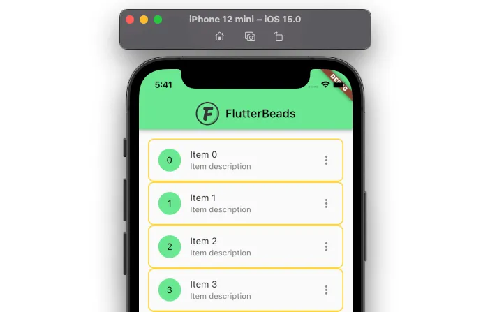
Changing ListTile border color
To add or change the ListTile border color, add the shape parameter with RoundedRectangleBorder() inside the ListTile widget. Inside the RoundedRectangleBorder widget, add the side property and assign the BorderSide(width: 2, color: Colors.amberAccent). Change the color parameter to the parameter of your choice.
Code Example
ListTile(
  shape: RoundedRectangleBorder(
    side: BorderSide(width: 2, color: Colors.amberAccent),
    borderRadius: BorderRadius.circular(10),
  ),
...
);
Output
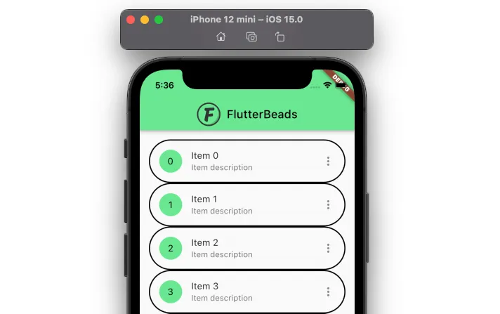
Adding ListTile bottom or top border
To add ListTile bottom or top border, you can wrap the ListTile widget inside the Container and add the decoration. Inside the decoration parameter, add the Boxdecoration widget with border parameter and assign it to either Border(bottom: new BorderSide()) or Border(bottom: new BorderSide()).
NOTE: If you want to add something like a divider between the ListTile item, there is a better solution. Please check here.
Code Example
//Bottom
Container(
  decoration: BoxDecoration(border: Border(bottom: BorderSide())),
  child: ListTile(
    leading: CircleAvatar(
      backgroundColor: const Color(0xff6ae792),
      child: Text(
        items[index],
        style: TextStyle(color: Colors.black),
      ),
    ),
    ...
  ),
);
//Top
Container(
  decoration: BoxDecoration(border: Border(top: BorderSide())),
  child: ListTile(
    leading: CircleAvatar(
      backgroundColor: const Color(0xff6ae792),
      child: Text(
        items[index],
        style: TextStyle(color: Colors.black),
      ),
    ),
    ...
  ),
);
Output

Problem: This approach creates a blank border at the top or bottom side. To overcome this, you can add the divider between ListTile.
ListTile shape border
You can add different shape borders to the ListTile by adding shape widgets such as RoundedRectangleBorder, StadiumBorder, and BeveledRectangleBorderto the shape parameter inside the ListTile widget.
Code Example
ListTile(
  shape: BeveledRectangleBorder( //<-- SEE HERE
    side: BorderSide(width: 2),
    borderRadius: BorderRadius.circular(20),
  ),
  ...
);
Output

Adding divider between ListTiles
To add a divider between ListTiles, you can use the ListView.separated widget. Inside the ListView.separated, add the itemCount and itemBuilder as usual. And then, add the separatorBuilder that returns the Divider widget.
Code Example
ListView.separated( //<-- SEE HERE
  itemCount: items.length,
  itemBuilder: (context, index) {
    return ListTile(
      leading: CircleAvatar(
        backgroundColor: const Color(0xff6ae792),
        child: Text(
          items[index],
          style: TextStyle(color: Colors.black),
        ),
      ),
      title: Text(
        'Item ${items[index]}',
      ),
      subtitle: Text('Item description'),
      trailing: Icon(Icons.more_vert),
    );
  },
  separatorBuilder: (context, index) {//<-- SEE HERE
    return Divider(
      thickness: 2,
    );
  },
)
Output

Conclusion
In this tutorial, we learned how to add and customize a ListTile border in Flutter with practical examples; we first saw how to add a border, add border-radius, change the border color, and later explored how to create a border on only one side using the best approach, i.e., adding divider between ListTiles.
Would you like to check other interesting Flutter tutorials?
