
The DropdownButton is one of the important widgets in building the form. It is used to allow users to select an item from the list of options. For example, gender selection. But sometimes, you may want to change its default appearance to match your design. So in this tutorial, we’ll see how to change Dropdown color in Flutter.
Here’s what we’ll cover:
- Change dropdown button color in Flutter
- Changing dropdown arrow color in Flutter
- Change the dropdown menu item background color
- Change the dropdown menu text color
- Changing the underline color of dropdown
- Change the color of selected text in the dropdown
Change dropdown button color in Flutter
To change the dropdown Button color in Flutter, simply wrap your DropdownButton widget inside the Container and provide the styling instructions inside the decoration property using the BoxDecoration widget. Using the color property (insideBoxDecoration) you can assign the color.
To change the dropdown button color:
- Wrap your
DropdownButtoninside theContainer. - Inside the
Container, add thedecorationproperty and assign theBoxDecorationwidget. - Inside the
BoxDecorationadd thecolorproperty and assign the color of your choice. - Run the app.
Code Example
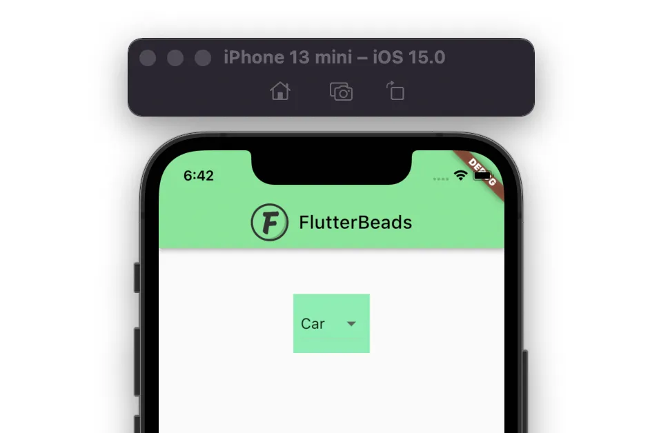
Container(
  padding: EdgeInsets.all(8),
  decoration: BoxDecoration(
    color: Colors.greenAccent, //<-- SEE HERE
  ),
  child: DropdownButton<String>(
    value: dropdownValue,
    onChanged: (String? newValue) {
      setState(() {
        dropdownValue = newValue!;
      });
    },
    items: <String>['Car', 'Train', 'Bus', 'Flight']
        .map<DropdownMenuItem<String>>((String value) {
      return DropdownMenuItem<String>(
        value: value,
        child: Text(
          value,
        ),
      );
    }).toList(),
  ),
)
Output
Also, see how to add color from hex. By using hex codes, you can easily create colors that match your brand or design vision.
Changing dropdown arrow color in Flutter
To change dropdown arrow color in Flutter, you can add the same arrow icon inside the icon property and change the color using the color property.
Here are the steps:
- Inside the
DropdownButtonwidget, add theiconparameter and assign theIconwidget. - Inside the
Iconwidget, add theIcons.arrow_drop_downicon. - Also, add the
colorparameter and assign the color.
Code Example
Container(
  padding: EdgeInsets.all(8),
  decoration: BoxDecoration(
    color: Colors.greenAccent,
  ),
  child: DropdownButton<String>(
    value: dropdownValue,
    icon: Icon(
      Icons.arrow_drop_down,
      color: Colors.black, // <-- SEE HERE
    ),
    onChanged: (String? newValue) {
      setState(() {
        dropdownValue = newValue!;
      });
    },
    items: <String>['Car', 'Train', 'Bus', 'Flight']
        .map<DropdownMenuItem<String>>((String value) {
      return DropdownMenuItem<String>(
        value: value,
        child: Text(
          value,
        ),
      );
    }).toList(),
  ),
)
Output
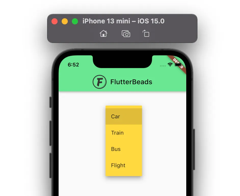
Change the dropdown menu item background color
To change the dropdown menu item background color, you can use the dropdownColor property and assign the color of your choice.
Code Example
DropdownButton<String>(
  value: dropdownValue,
  dropdownColor: Colors.amberAccent, //<-- SEE HERE
  onChanged: (String? newValue) {
    setState(() {
      dropdownValue = newValue!;
    });
  },
  items: <String>['Car', 'Train', 'Bus', 'Flight']
      .map<DropdownMenuItem<String>>((String value) {
    return DropdownMenuItem<String>(
      value: value,
      child: Text(
        value,
      ),
    );
  }).toList(),
)
Output
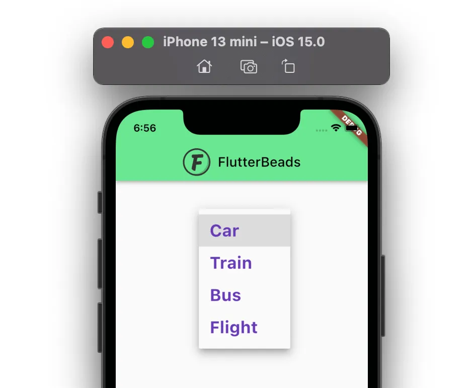
Change the dropdown menu text color
To change the dropdown menu text color, use the style property and assign the TextStyle widget with the parameter called color.
Code Example
DropdownButton<String>(
  value: dropdownValue,
  style: const TextStyle(
      color: Colors.deepPurple, //<-- SEE HERE
      fontSize: 25,
      fontWeight: FontWeight.bold),
  onChanged: (String? newValue) {
    setState(() {
      dropdownValue = newValue!;
    });
  },
  items: <String>['Car', 'Train', 'Bus', 'Flight']
      .map<DropdownMenuItem<String>>((String value) {
    return DropdownMenuItem<String>(
      value: value,
      child: Text(
        value,
      ),
    );
  }).toList(),
)
Output
Changing the underline color of dropdown
If you notice carefully, you might find the thin underline below the selected item. To change underline color use the underline property of the Dropdown widget and then assign the Container widget with height and color property.
Here’s how you do it
- Inside the
Dropdownwidget, and add theunderlineproperty and assign theContainerwidget. - Inside the
Container, add thecolorproperty and assign the color. - (Optional) Inside the
Container, add theheightproperty and give it a value like 2 or 3.
Code Example
DropdownButton<String>(
  value: dropdownValue,
  underline: Container(
    height: 3,
    color: Colors.deepPurpleAccent, //<-- SEE HERE
  ),
  onChanged: (String? newValue) {
    setState(() {
      dropdownValue = newValue!;
    });
  },
  items: <String>['Car', 'Train', 'Bus', 'Flight']
      .map<DropdownMenuItem<String>>((String value) {
    return DropdownMenuItem<String>(
      value: value,
      child: Text(
        value,
      ),
    );
  }).toList(),
)
Output

Change the color of selected text in the dropdown
To change the color of the selected text inside the dropdown button in Flutter, you can make use of the selectedItemBuilder and create a new widget that shows when the item is selected. The idea is to pass the same Text with a different color.
Code Example
DropdownButton<String>(
  value: dropdownValue,
  onChanged: (String? newValue) {
    setState(() {
      dropdownValue = newValue!;
    });
  },
  selectedItemBuilder: (BuildContext context) { //<-- SEE HERE
    return <String>['Car', 'Train', 'Bus', 'Flight']
        .map((String value) {
      return Text(
        dropdownValue,
        style: const TextStyle(color: Colors.red, fontSize: 30),
      );
    }).toList();
  },
  items: <String>['Car', 'Train', 'Bus', 'Flight']
      .map<DropdownMenuItem<String>>((String value) {
    return DropdownMenuItem<String>(
      value: value,
      child: Text(
        value,
      ),
    );
  }).toList(),
)
Output

Conclusion
In this tutorial, we learned how to change dropdown color in Flutter. We first saw how to change the dropdown button color and then its arrow color. We also explored how to customize the dropdown widget using other properties. Finally, we saw changing the selected text color.
Would you like to check other interesting Flutter tutorials?
