
The ElevatedButton is one of the most and widely used widgets in Flutter. The ElevatedButton was introduced with the release of Flutter v1.22 in October 2020. As it was released to solve the problems associated with the old Flutter buttons, the way of changing the color of the Elevated Button changed as well. So this tutorial, we’ll explore how to change the elevated button color in Flutter with practical examples.
Here’s what we’ll cover:
- The Problem
- Steps to Change the Elevated Button Color in Flutter
- Changing the Text Color of the Elevated Button
- Changing the Elevated Button Color on press
- Changing the Elevated Button Color on hover
- Customize the Elevated Button Color for Disable State
- Change the Shadow Color of the Elevated Button
- Changing the Elevated Button Border Color
- Managing Elevated Button Color at the App Level
The Problem
When you add an ElevatedButton in your app, it sets the primarySwatch color as the background color of a button. For example, if you just created a new app, you may see the ElevatedButton with the blue background because the primarySwatch is set to the Colors.blue.
Code Example:
MaterialApp(
  title: 'Flutter Demo',
  theme: ThemeData(
    primarySwatch: Colors.blue,
  ),
  home: ElevatedButtonColorDemo(),
);
ElevatedButton(
  onPressed: () {},
  child: const Text(
    'Elevated Button',
    style: TextStyle(fontSize: 40),
  ),
)
Output:

Also, see how to add color from hex. By using hex codes, you can easily create colors that match your brand or design vision.
Change the Elevated Button Color in Flutter
You may want to change the background color of the Elevated button while keeping the primarySwatch to a different color.
To change the Elevated Button color in Flutter, simply set the style property of Elevated Button from the ElevatedButton.styleFrom() static method and set the primary property to the appropriate color.
Steps to change Elevated Button Color in Flutter:
- Add the ElevatedButton widget.
- Add the style parameter (inside ElevatedButton) and assign the ElevatedButton.styleFrom().
- Add the primary parameter (inside ElevatedButton.styleFrom) and assign any color.
- Run the App.
Code Example:
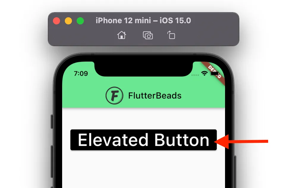
ElevatedButton(
  onPressed: () {},
  style: ElevatedButton.styleFrom(
    primary: Colors.black, // Background color
  ),
  child: const Text(
    'Elevated Button',
    style: TextStyle(fontSize: 40),
  ),
)
Output:
Changing the Text Color of the Elevated Button
Sometimes you may also want to change the text color of the Elevated Button. You can do that by just assigning the color of your choice to onPrimary property.
To change Text Color of the Elevated Button:
- Add the style parameter (inside ElevatedButton) and assign the ElevatedButton.styleFrom().
- Add the onPrimary parameter (inside ElevatedButton.styleFrom) and assign any color.
- Run the App.
Code Example:
ElevatedButton(
  onPressed: () {},
  style: ElevatedButton.styleFrom(
    primary: Colors.black, // Background color
    onPrimary: Colors.amber, // Text Color (Foreground color)
  ),
  child: const Text(
    'Elevated Button',
    style: TextStyle(fontSize: 40),
  ),
)
Output:

Changing the Elevated Button Color on press
To change the Elevated button color on pess, you can use the ButtonStyle widget. Inside the ButtonStyle widget you can add the overlayColor property and assign the color based on state such as on press, on hover and on focued.
To change Elevated Button Color on press:
- Add the ElevatedButton widget.
- Add the overlayColor parameter (inside ElevatedButton) and assign the aterialStateProperty.resolveWith().
- Check whether the state is pressed, if yes retrun the color of your choice.
Code Example
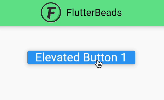
ElevatedButton(
  onPressed: () {},
  style: ButtonStyle(
    overlayColor: MaterialStateProperty.resolveWith<Color?>(
      (Set<MaterialState> states) {
        if (states.contains(MaterialState.pressed))
          return Colors.redAccent; //<-- SEE HERE
        return null; // Defer to the widget's default.
      },
    ),
  ),
  child: const Text(
    'Elevated Button 1',
    style: TextStyle(fontSize: 24),
  ),
)
Output
Changing the Elevated Button Color on hover
To change the Elevated button color on hover, you can use the ButtonStyle widget. Inside the ButtonStyle widget you can add the overlayColor property and assign the color based on state such as on press, on hover and on focued.
To change Elevated Button Color on hover:
- Add the ElevatedButton widget.
- Add the overlayColor parameter (inside ElevatedButton) and assign the aterialStateProperty.resolveWith().
- Check whether the state is hovered, if yes retrun the color of your choice.
Code Example
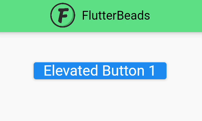
ElevatedButton(
              onPressed: () {},
              style: ButtonStyle(
                overlayColor: MaterialStateProperty.resolveWith<Color?>(
                  (Set<MaterialState> states) {
                    if (states.contains(MaterialState.hovered))
                      return Colors.redAccent; //<-- SEE HERE
                    return null; // Defer to the widget's default.
                  },
                ),
              ),
              child: const Text(
                'Elevated Button 1',
                style: TextStyle(fontSize: 24),
              ),
            ),
Output
Change the Shadow Color of the Elevated Button
If you are designing your app to be fully compatible with your brand guidelines, then you may also want to change the shadow color of the Elevated Button. To change the shadow color, your button must be elevated first.
To Change the Shadow Color of the Elevated Button:
- Inside the Elevated Button, add the elevation property and set it to 20.
- Now add the shadowColor property (Inside the Elevated Button) and set it to the color you want as shadow color.
- Run the App.
Code Example:
ElevatedButton(
  onPressed: () {},
  style: ElevatedButton.styleFrom(
    primary: Colors.black,
    onPrimary: Colors.amber,
    elevation: 20,  // Elevation
    shadowColor: Colors.amber, // Shadow Color
  ),
  child: const Text(
    'Elevated Button',
    style: TextStyle(fontSize: 40),
  ),
)
Output:

Customize the Elevated Button Color for Disable State
When the button is disabled, by default it shows the grey color. To change the disable color of the Elevated Button, simply add the onSurface property inside the Elevated Button and set the appropriate color.
Code Example:
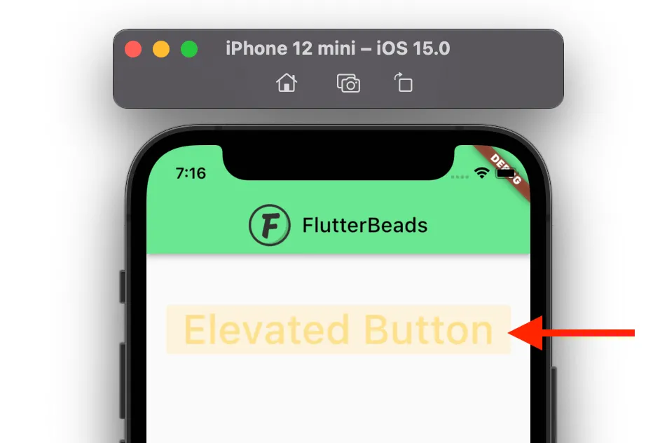
ElevatedButton(
  onPressed: null,
  style: ElevatedButton.styleFrom(
    primary: Colors.black,
    onPrimary: Colors.amber,
    onSurface: Colors.amber, // Disable color
  ),
  child: const Text(
    'Elevated Button',
    style: TextStyle(fontSize: 40),
  ),
)
Hint: Make sure you pass the null to onPressed property while testing the disable color.
Output:
Changing the Elevated Button Border Color
To change the Elevated Button Border Color:
- Add the side property, and set the BorderSide().
- Inside the BorderSide() add the width and color property and assign the appropriate color.
Code Example:
ElevatedButton(
  onPressed: () {},
  style: ElevatedButton.styleFrom(
    primary: Colors.black,
    onPrimary: Colors.amber,
    side: BorderSide(color: Colors.red, width: 5),
  ),
  child: const Text(
    'Elevated Button',
    style: TextStyle(fontSize: 40),
  ),
)
Output:

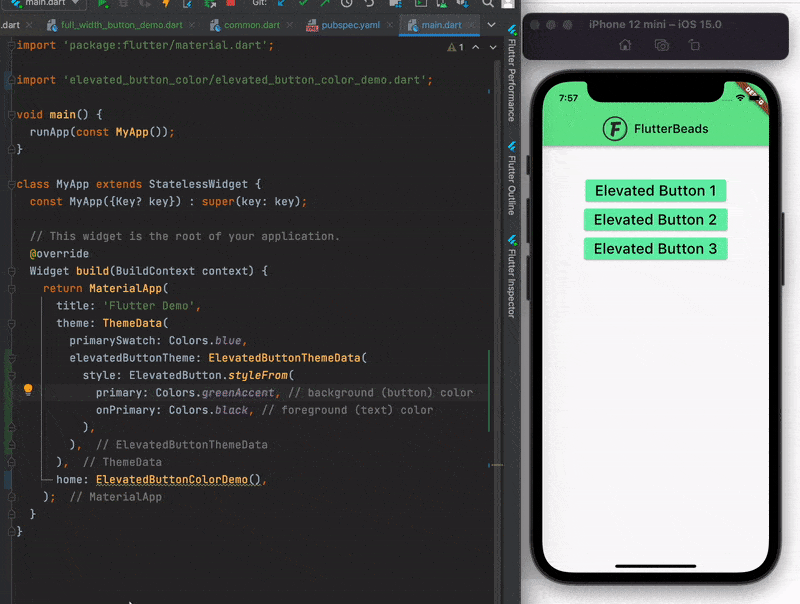
Managing Elevated Button Color at the App Level
Changing the color of every Elevated Button in your app is not a scalable solution. What if your app branding gets changed. Would you like to sit for long hours searching for all the button and replacing it with new colors? NO of course. Let’s see how you can set the theme of the Elevated Button at the app level. This will make all the Elevated Button in your app look the same and you can change them all instantly.
Here are the steps:
- Go to your main.dart file.
- Inside the MaterialApp, find the ThemeData widget.
- Add the elevatedButtonTheme property inside and assign the ElevatedButtonThemeData().
- Add the style property and change the color as you would change it for normal ElevatedButton.
- Place the ElevatedButton widget anywhere in your Flutter app and see.
Code Example:
MaterialApp(
  title: 'Flutter Demo',
  theme: ThemeData(
    primarySwatch: Colors.blue,
    elevatedButtonTheme: ElevatedButtonThemeData(
      style: ElevatedButton.styleFrom(
        primary: Colors.greenAccent, // background (button) color
        onPrimary: Colors.black, // foreground (text) color
      ),
    ),
  ),
  home: ElevatedButtonColorDemo(),
);
@override
Widget build(BuildContext context) {
  return Scaffold(
    appBar: ...
      backgroundColor: const Color(0xff6ae792),
    ),
    body: Center(
      child: Column(
        children: [
          SizedBox(
            height: 50,
          ),
          ElevatedButton(
            onPressed: () {},
            child: const Text(
              'Elevated Button 1',
              style: TextStyle(fontSize: 24),
            ),
          ),
          ElevatedButton(
            onPressed: () {},
            child: const Text(
              'Elevated Button 2',
              style: TextStyle(fontSize: 24),
            ),
          ),
          ElevatedButton(
            onPressed: () {},
            child: const Text(
              'Elevated Button 3',
              style: TextStyle(fontSize: 24),
            ),
          )
        ],
      ),
    ),
  );
}
Output:
That’s it. Thanks!
Conclusion
In this tutorial, we learned how to change the elevated button color in Flutter. We also explored how to change the background and text color, shadow color, border color, disabled state color with practical examples. Finally, we learned the way to set colors for all the Elevated Button inside our app from a single place.
Would you like to check other interesting Flutter tutorials?