
The TextButton widget in Flutter is used to show the less-prominent action. It is generally used inside the UI elements such as Dialog and Cards. The TextButton is the replacement of the FlatButton and makes it easy to customize without affecting the other buttons. While working on the Flutter app, you may want to customize it to match your design. So in this tutorial, we learn how to change the Text Button color in Flutter. We’ll also explore changing the color when Text Button is disabled, hovered, and when it is inside the AboutDialog.
Here’s what we’ll cover:
- The Problem
- Steps to Change the Text Button Color in Flutter
- How to Change the Background Color of the Text Button
- Customize the Text Button Color for Disable State
- Changing the Text Button Border Color
- Setting Text Button Color on Hover
- Changing Text Button Color inside AboutDialog
The Problem
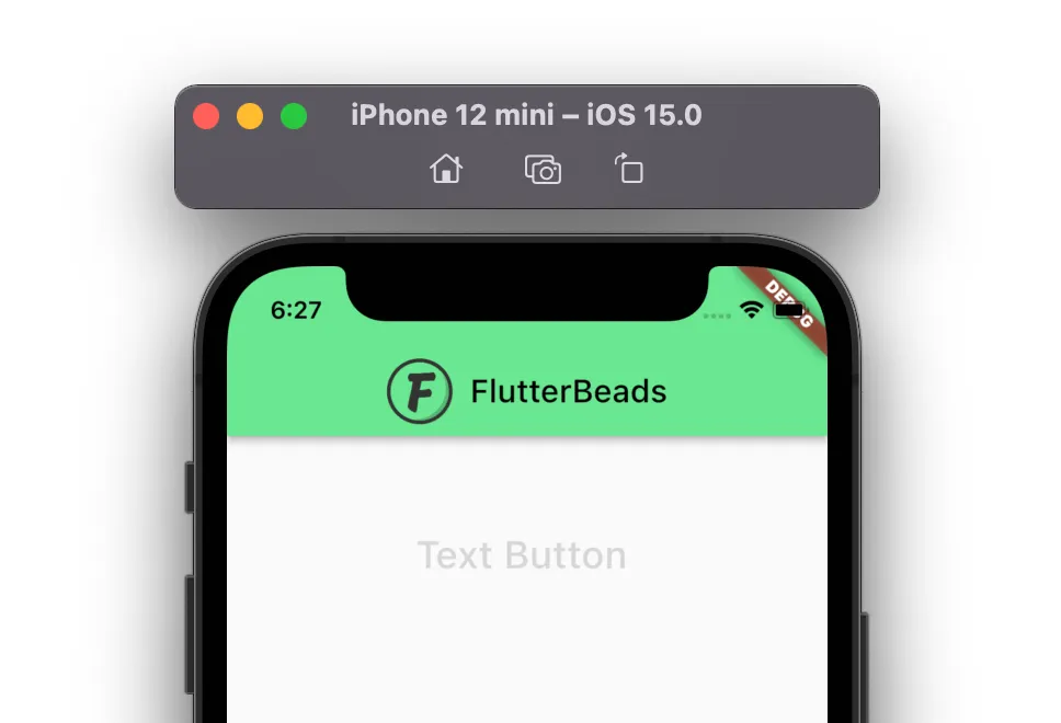
When you add the Text Button widget in your app, the color given to it, is by default the primarySwatch color. If you just started with the new app, you may see the Text Button with the Blue color.
Code Example 1:
MaterialApp(
  title: 'Flutter Demo',
  theme: ThemeData(
    primarySwatch: Colors.blue,
  ),
  home: TextButtonColorDemo(),
);
TextButton(
  onPressed: () {},
  child: const Text(
    'Text Button ',
    style: TextStyle(fontSize: 24),
  ),
)
Problem 1:

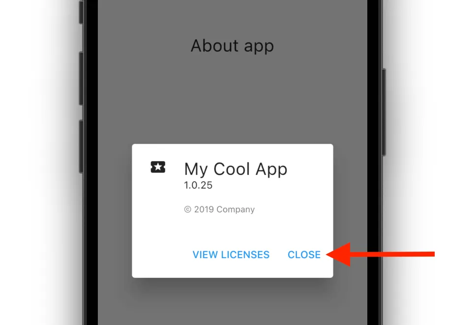
Sometimes, you may want to set the color to Text Button which is different from the primarySwatch color. For example, changing the text button color inside the AboutDialog or Card.
Code Example 2:
MaterialApp(
  title: 'Flutter Demo',
  theme: ThemeData(
    primarySwatch: Colors.blue,
  ),
  home: TextButtonColorDemo(),
);
const AboutListTile(
  child: Center(
      child: Text(
    'About app',
    style: TextStyle(fontSize: 24),
  )),
  applicationIcon: Icon(
    Icons.local_play,
  ),
  applicationName: 'My Cool App',
  applicationVersion: '1.0.25',
  applicationLegalese: '© 2019 Company',
  aboutBoxChildren: [
    ///Content goes here...
  ],
)
Problem 2:
Steps to Change the Text Button Color in Flutter
To change the Text Button color in Flutter, simply add the style parameter inside the Text Button and assign the TextButton.styleFrom() with the primary property set to any color of your choice.
Here’s is how you do that:
Step 1: Add the style parameter (inside TextButton) and assign the TextButton.styleFrom().
Step 2: Inside the TextButton.styleFrom(), Add the primary parameter and assign any color.
Step 3: Run the App.
Code Example:
TextButton(
  onPressed: () {},
  style: TextButton.styleFrom(
    primary: Colors.purpleAccent, // Text Color
  ),
  child: const Text(
    'Text Button ',
    style: TextStyle(fontSize: 24),
  ),
)
Output:

Looking for a way to add some personality to your Flutter app? Our other blog post on how to add color from hex is just what you need. By using hex codes, you can easily create colors that match your brand or design vision.
How to Change the Background Color of the Text Button
To change the backgroundColor of the Text Button, you can add the backgroundColor property inside the TextButton.styleFrom() and give it a proper color
Here’s are the steps:
- Add the style parameter (inside TextButton) and assign the TextButton.styleFrom().
- Inside the TextButton.styleFrom(), Add the backgroundColor parameter and assign any color.
Code Example:
TextButton(
  onPressed: () {},
  style: TextButton.styleFrom(
      primary: Colors.purpleAccent,
      backgroundColor: Colors.black, // Background Color
),
  child: const Text(
    'Text Button ',
    style: TextStyle(fontSize: 24),
  ),
)
Output:

Customize the Text Button Color for Disable State
To change the Text Button Color when it is disabled:
- Simply add the onSurface property inside the Text Button and set the suitable color.
Code Example:
TextButton(
  onPressed: null,
  style: TextButton.styleFrom(
    primary: Colors.purpleAccent,
    onSurface: Colors.grey, // Disable color
  ),
  child: const Text(
    'Text Button ',
    style: TextStyle(fontSize: 24),
  ),
)
Hint: Make sure you pass the null to onPressed property while testing the disable color.
Output:
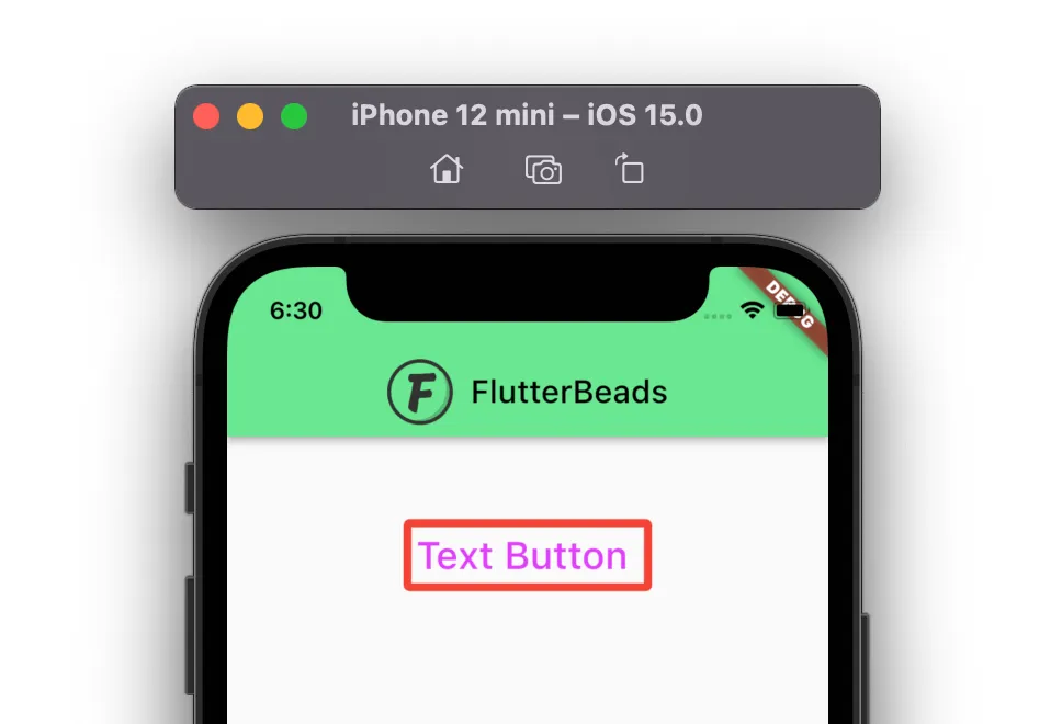
Changing the Text Button Border Color
To change the Text Button Border Color, you must add the border first and then customize it.
Here’s how you add border and change color:
- Add the side property, and set the BorderSide().
- Inside the BorderSide() add the width and color property with appropriate values.
Code Example:
TextButton(
  onPressed: () {},
  style: TextButton.styleFrom(
    primary: Colors.purpleAccent,
    side: BorderSide(color: Colors.red, width: 5),
  ),
  child: const Text(
    'Text Button ',
    style: TextStyle(fontSize: 24),
  ),
)
Output:
Setting Text Button Color on Hover
If you are developing the web app in Flutter, you may want to highlight the Text Button when the mouse hovers over it.
To set hover over color:
- Inside the Style property, add the ButtonStyle().
- Now, inside the ButtonStyle() add the foregroundColor or backgroundColor and decide which color to show based on the MaterialState.
Code Example:
TextButton(
  onPressed: () {},
  style: ButtonStyle(
    foregroundColor: MaterialStateProperty.resolveWith<Color>(
        (Set<MaterialState> states) {
      if (states.contains(MaterialState.hovered))
        return Colors.green;
      return Colors
          .purpleAccent;
    }),
  ),
  child: const Text(
    'Text Button ',
    style: TextStyle(fontSize: 24),
  ),
)
Output:

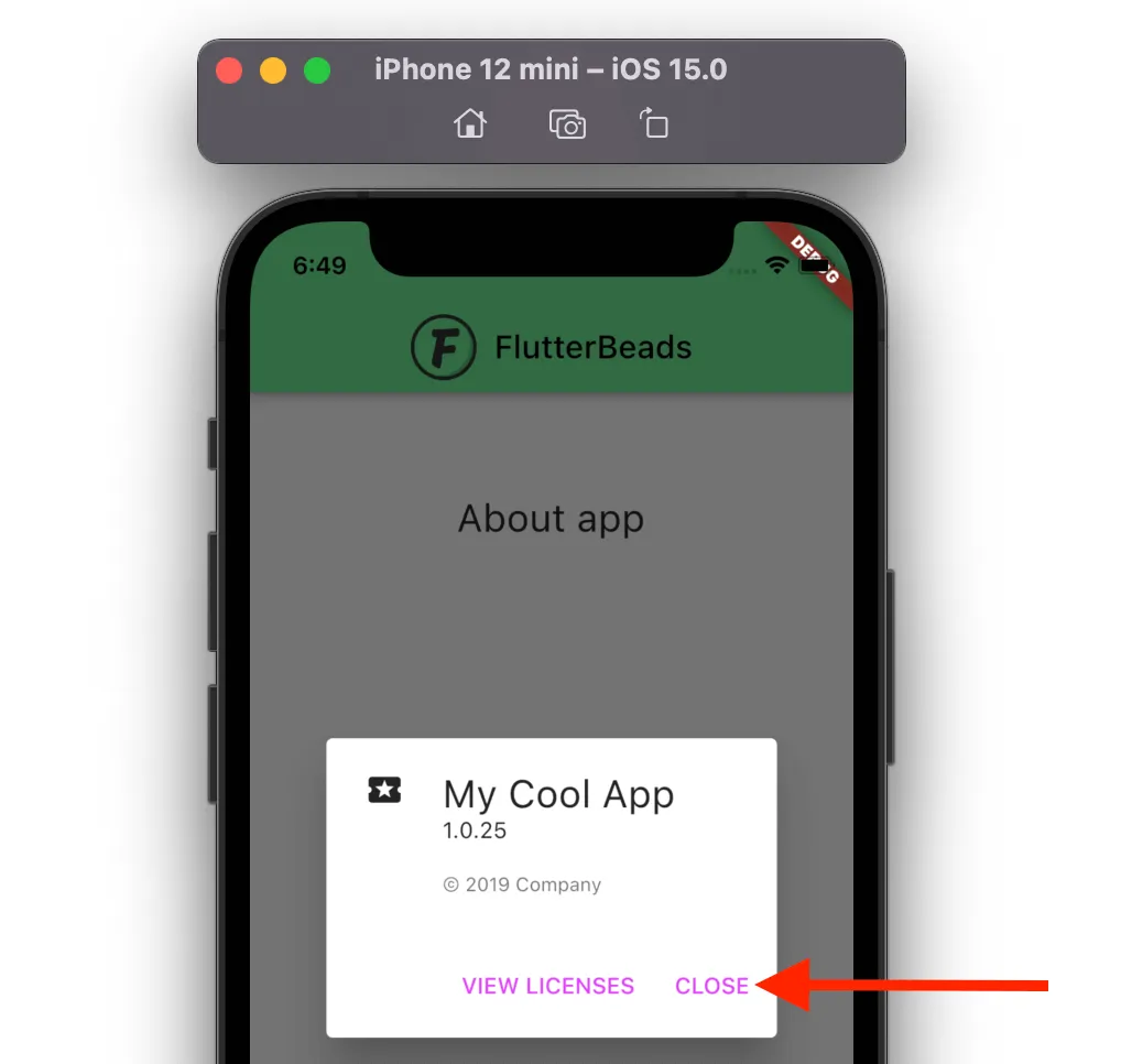
Changing Text Button Color inside AboutDialog
If you have added the AboutDialog in your Flutter app, when the dialog gets open, you see the text color of the button is the same as the primarySwatch of the app.
To change the color of the text button inside AboutDialog:
- Go to your main.dart file.
- Inside the MaterialApp, find the ThemeData widget.
- Add the textButtonTheme property.
- Add the style property and change the color as you would change it for normal TextButton.
- Open the AboutDialog and see the result.
Code Example:
MaterialApp(
  title: 'Flutter Demo',
  theme: ThemeData(
    primarySwatch: Colors.blue,
    textButtonTheme: TextButtonThemeData(
      style: TextButton.styleFrom(
        primary: Colors.purpleAccent, // This is a custom color variable
      ),
    ),
  ),
  home: TextButtonColorDemo(),
);
@override
Widget build(BuildContext context) {
  return Scaffold(
    appBar: ...
    body: Center(
      child: Column(
        children: [
          SizedBox(
            height: 50,
          ),
          const AboutListTile(
            child: Center(
                child: Text(
              'About app',
              style: TextStyle(fontSize: 24),
            )),
            applicationIcon: Icon(
              Icons.local_play,
            ),
            applicationName: 'My Cool App',
            applicationVersion: '1.0.25',
            applicationLegalese: '© 2019 Company',
            aboutBoxChildren: [
              ///Content goes here...
            ],
          )
        ],
      ),
    ),
  );
}
Output:
That’s it. Thanks!
Conclusion
In this tutorial, we learned how to change the Text Button color in Flutter with a practical example. We also saw how to change the color when Text Button is disabled, hovered. We learned the way to change the text button color when it is inside the AboutDialog.
Would you like to check other interesting Flutter tutorials?