
The TextField and TextFormField widgets in Flutter are the most used widgets. It is used to get user input in a variety of forms such as email, password, phone, home address, etc. But after adding the default TextField/TextFormField, sometimes you might need to customize the border of TextField/TextFormField. So in this tutorial, we will see how to add and customize TextField/TextFormField border in Flutter.
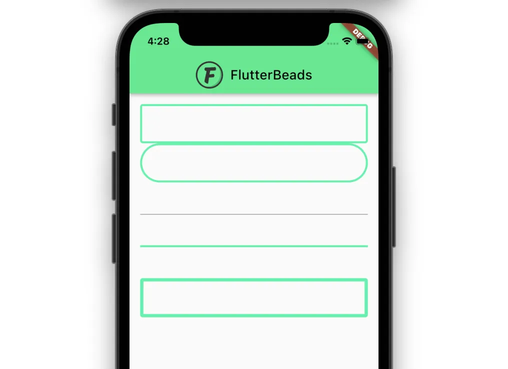
Here are different versions of the TextField/TextFormField border:
Here’s what we’ll cover:
- How to add border to a TextField or TextFormField in Flutter
- How to add border radius or rounded border to TextField or TextFormField
- Display TextField or TextFormField error border
- Display TextField or TextFormField focus border
- Show only the bottom border in TextField or TextFormField
- How to change TextField or TextFormField border width or size
- Removing TextField or TextFormField border
- Customize TextField or TextFormField border globally(Bonus ⭐️)
How to add border to a TextField or TextFormField in Flutter
To add a border to a TextField/TextFormField in Flutter, you can specify the decoration property and then use the InputDecoration and OutlineInputBorder widget. The OutlineInputBorder widget has the borderSide widget which you can use to pass in the BorderSide widget with width and color parameter to create the border.
Here are step by step instructions the to add border to textfield/textformfield in Flutter:
- Locate the file where you have placed the
TextField/TextFormFieldwidget. - Inside the
TextField/TextFormFieldwidget, add thedecorationparameter and assign theInputDecorationwidget. - Inside the
InputDecorationwidget, add theenabledBorderparameter and assign theOutlineInputBorderwidget. - Inside the
OutlineInputBorder, add theBorderSidewidget withcolorparameter and set the color of your choice.
Code Example:
// Note: Same code is applied for the TextFormField as well
const TextField(
  decoration: InputDecoration(
    enabledBorder: OutlineInputBorder(
      borderSide: BorderSide(
          width: 3, color: Colors.greenAccent), //<-- SEE HERE
    ),
  ),
)
Output:

How to add border radius or rounded border to TextField or TextFormField
To add border radius or create rounded border around the TextField/TextFormField widget, add the decoration property and then use OutlineInputBorder widget. The OutlineInputBorder widget accepts the borderRadius parameter. You can use the borderRadius parameter with BorderRadius.circular(50.0) to create the cricular border around the TextField.
Code Example:
// Note: Same code is applied for the TextFormField as well
TextField(
  decoration: InputDecoration(
    enabledBorder: OutlineInputBorder(
      borderSide:
          BorderSide(width: 3, color: Colors.greenAccent), //<-- SEE HERE
      borderRadius: BorderRadius.circular(50.0),
    ),
  ),
)
Output:

Display TextField or TextFormField error border
To display TextField/TextFormField error border, you can add the decoration parameter inside the TextField widget and then assign the InputDecoration widget. Inside the InputDecoration, you can add border for the error state by specifying errorBorder the parameter. You can assign the OutlineInputBorder widget and add border as usual.
Code Example:
// Note: Same code is applied for the TextFormField as well
const TextField(
  decoration: InputDecoration(
    errorBorder: OutlineInputBorder( //<-- SEE HERE
      borderSide: BorderSide(
          width: 3, color: Colors.redAccent),
    ),
  ),
)
Output:

Display TextField or TextFormField focus border
To display TextField/TextFormField error border, you can add the decoration parameter inside the TextField widget and then assign the InputDecoration widget. Inside the InputDecoration, you can add border for the error state by specifying focusedBorder the parameter. You can assign the OutlineInputBorder widget and add border as usual.
Code Example:
// Note: Same code is applied for the TextFormField as well
const TextField(
  decoration: InputDecoration(
    focusedBorder: OutlineInputBorder( //<-- SEE HERE
      borderSide: BorderSide(
          width: 3, color: Colors.blueAccent),
    ),
  ),
)
Output:

Show only the bottom border in TextField or TextFormField
To show only the bottom border in TextField/TextFormField, you can specify the decoration property and then use the InputDecoration and UnderlineInputBorder widget. The UnderlineInputBorder widget accepts the borderSide widget which you can use to create the border.
Code Example:
// Note: Same code is applied for the TextFormField as well
const TextField(
  decoration: InputDecoration(
    enabledBorder: UnderlineInputBorder( //<-- SEE HERE
      borderSide: BorderSide(
          width: 3, color: Colors.greenAccent),
    ),
  ),
)
Output:

How to change TextField or TextFormField border width or size
To change the TextField/TextFormField border width, first add the border as usual and then simply modify the width value inside the BorderSide parameter.
Code Example:
// Note: Same code is applied for the TextFormField as well
TextField(
  decoration: InputDecoration(
    enabledBorder: OutlineInputBorder(
      borderSide:
          BorderSide(
          width: 5, //<-- SEE HERE
          color: Colors.greenAccent,),
      borderRadius: BorderRadius.circular(50.0),
    ),
  ),
),
//----------
const TextField(
  decoration: InputDecoration(
    enabledBorder: UnderlineInputBorder(
      borderSide: BorderSide(
        width: 3, //<-- SEE HERE
        color: Colors.greenAccent,
      ),
    ),
  ),
)
Output:

Removing TextField or TextFormField border
To remove the TextField/TextFormField border you can visit the in depth tutorial here.
Customize TextField or TextFormField border globally
In the previous section, we saw how to customize the TextField/TextFormField border at the page level. but sometimes you might be looking to have a common style across all the pages of your app. In that case, you might want to customize the TextField/TextFormField border color at the app level.
You can change the TextField/TextFormField border color globally by defining the inputDecorationTheme and then adding the OutlineInputBorder widget. Inside the OutlineInputBorder widget, you can specify which type of border you want to change. for example, enabledBorder, focusedBorder, and so on, and then assign the color.
Here’s how you do it:
- Locate the
MaterialAppwidget. - Inside the MaterialApp, add the
themeparameter withThemeDataclass assigned. - Inside the
ThemeDataadd theinputDecorationThemeparameter and then assign theInputDecorationTheme. - Inside the
InputDecorationThemeadd theenabledBorderparameter and then assign theOutlineInputBorder. - Inside the
OutlineInputBorderadd theborderSideparameter and then assign theBorderSidewithcolorof your choice.
Code Example:
MaterialApp(
  title: 'Flutter Demo',
  theme: ThemeData(
    primarySwatch: Colors.blue,
    inputDecorationTheme: const InputDecorationTheme(
      enabledBorder: OutlineInputBorder(
        borderSide: BorderSide(width: 3, color: Colors.greenAccent),
      ),
      focusedBorder: OutlineInputBorder(
        borderSide: BorderSide(width: 3, color: Colors.amberAccent),
      ),
    ),
  ),
  home: ChangeTextFieldBorderColorDemo(),
);
Conclusion
In this tutorial, we learned how to customize textfield and textformfield border in Flutter with practical examples, we first saw how to add border, add border radius, add border for focsed and error state and later explored how to add border to only bottom of TextField/TextFormField. We also went through the code to customize the border at app level.
Would you like to check other interesting Flutter tutorials?
