Buttons are essential components for any app. It allows users to perform an action when tapped. For example, navigate to another page, load data, send information, etc. Flutter provides you the out of box support for buttons. But sometimes, you may need to add an icon with the text to the buttons to match your design. So in this tutorial, we’ll see the top 3 ways to create a Flutter button with icon and text.
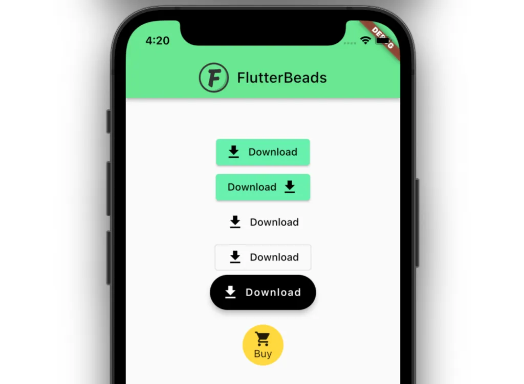
At the end of this tutorial, you’ll be able to create buttons like this:
Here’s what we’ll cover:
- Using ElevatedButton to Create Flutter Button with Icon and Text
- Using FloatingActionButton
- Using ClipOval, InkWell
Using ElevatedButton to Create Flutter Button with Icon and Text
The simplest way to create a Flutter button with icon and text is to use the new Material button called ElevatedButton with an icon constructor. ElevatedButton.icon() gives you the ability to add the icon and label parameter to the button. The ElevatedButton was introduced with the release of Flutter v1.22 in October 2020.
To create a Button with an Icon using ElevatedButton in Flutter:
- Add the ElevatedButton.icon() widget.
- Add the icon parameter (inside ElevatedButton) and assign the Icon(
Icons.download, size: 24.0,). - Add the label parameter (inside ElevatedButton) and give it a Text(‘Download’) widget.
Code Example:
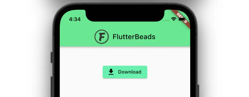
ElevatedButton.icon(
  onPressed: () {},
  icon: Icon( // <-- Icon
    Icons.download,
    size: 24.0,
  ),
  label: Text('Download'), // <-- Text
),
Output:
Note: Similarly, if you want to add icon and text to TextButton or OutlinedButton, just follow the previous steps and replace the ElevatedButton with TextButton and OutlinedButton.
Code Example:
Column(
  children: [
    SizedBox(
      height: 50,
    ),
    ElevatedButton.icon(   // <-- ElevatedButton
      onPressed: () {},
      icon: Icon(
        Icons.download,
        size: 24.0,
      ),
      label: Text('Download'),
    ),
    TextButton.icon(     // <-- TextButton
      onPressed: () {},
      icon: Icon(
        Icons.download,
        size: 24.0,
      ),
      label: Text('Download'),
    ),
    OutlinedButton.icon( // <-- OutlinedButton
      onPressed: () {},
      icon: Icon(
        Icons.download,
        size: 24.0,
      ),
      label: Text('Download'),
    ),
  ],
)
Output:
If you’re interested in creating a button with an icon and text in Flutter, there are several ways we explain in this post. However, if you want to add a rounded button in your app, you should definitely check out our post on Rounded Button in Flutter.
Displaying Icon on the Right Side
Here are the steps to display an icon on the right side of the text:
- Add the Row widget inside the ElevatedButton.
- Add the Text(‘Download’) width inside the Row.
- Then add the SizedBox(width: 5,) followed by the actual icon widget i.e. Icon(Icons.download,size: 24.0,).
Code Example:
ElevatedButton(
  onPressed: () {},
  child: Row(
    mainAxisSize: MainAxisSize.min,
    children: [
      Text('Download'), // <-- Text
      SizedBox(
        width: 5,
      ),
      Icon( // <-- Icon
        Icons.download,
        size: 24.0,
      ),
    ],
  ),
),
Output:
Using FloatingActionButton
You can also use the FloatingActionButton to create the button with icon and text. The idea is to use the FloatingActionButton.extended() constructor. By default, the FloatingActionButton widget with the extended constructor sets the isExtended parameter to true which can be used to add the icon with the text.
Here’s how you do it:
- Add the FloatingActionButton.extended() widget.
- Add the icon parameter (inside FloatingActionButton) and assign the Icon(Icons.download, size: 24.0,).
- Add the label parameter (inside FloatingActionButton) and give it a Text(‘Download’) widget.
Code Example:
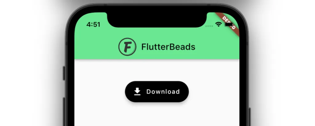
FloatingActionButton.extended(
  label: Text('Download'), // <-- Text
  backgroundColor: Colors.black,
  icon: Icon( // <-- Icon
    Icons.download,
    size: 24.0,
  ),
  onPressed: () {},
),
Output:
Using ClipOval, InkWell
If you need more customization with adding an icon with text to the button, you can opt for creating your own button from scratch. Let’s create a fully rounded button with the help of using the ClipOval and InkWell widget and show the icon with text.
Here’s how exactly you do it:
- Add the ClipOval() widget.
- Add the Material() widget (inside the ClipOval).
- Add the InkWell widget (inside the Material).
- Add the Row widget (inside the InkWell).
- Add the actual icon widget i.e. Icon(Icons.shopping_cart).
- Finally, add the Text(‘Buy’) widget after the icon.
Code Example:
SizedBox.fromSize(
  size: Size(56, 56),
  child: ClipOval(
    child: Material(
      color: Colors.amberAccent,
      child: InkWell(
        splashColor: Colors.green,
        onTap: () {},
        child: Column(
          mainAxisAlignment: MainAxisAlignment.center,
          children: <Widget>[
            Icon(Icons.shopping_cart), // <-- Icon
            Text("Buy"), // <-- Text
          ],
        ),
      ),
    ),
  ),
)
Output:
Conclusion
In this tutorial, we saw the top 3 ways to create a Flutter button with icon and text with practical examples. We also learned how to make use of different buttons such as ElevatedButton, TextButton, OutlinedButton, FloatingAction Button. If you are not satisfied with what the default button gives you, then we also explored how to create a fully customizable button with an icon and text.
FAQs
How to add icon in elevated button in flutter?
To add icon in elevated button in flutter, add the icon parameter (inside ElevatedButton) and assign the Icon(Icons.download, size: 24.0,)
After that, add the label parameter (inside ElevatedButton) and give it a Text(‘Download’) widget.
Would you like to check other interesting Flutter tutorials?

Thanks Pinkesh! I find your website very useful and resourceful for me. Today is my second time visiting your blog. I’ll be coming back for more helpful contents..
Ps. Your website is such amazing to behold! A very sleek concept. Very well UX/UI defined.